
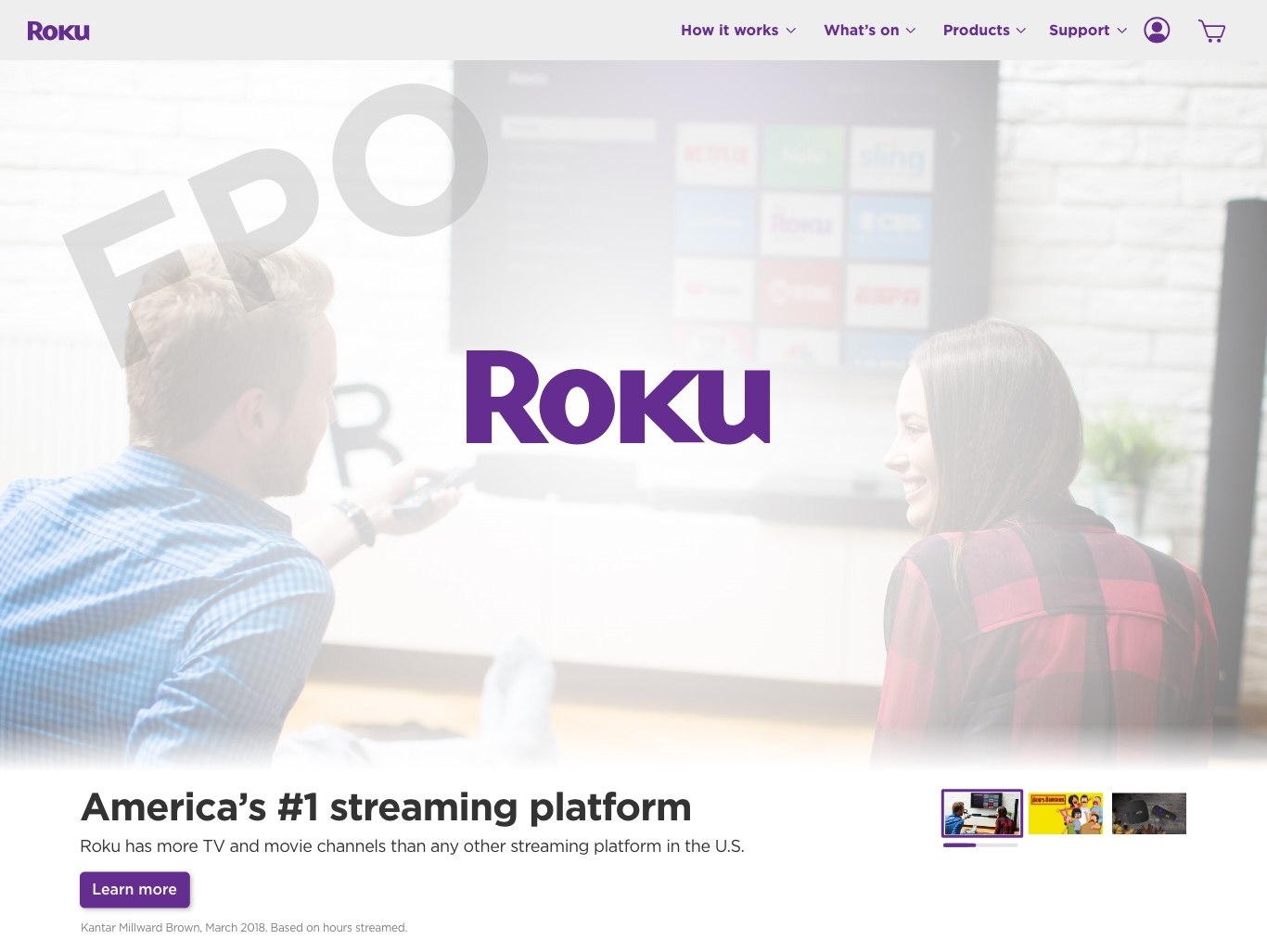
Roku.com Hero
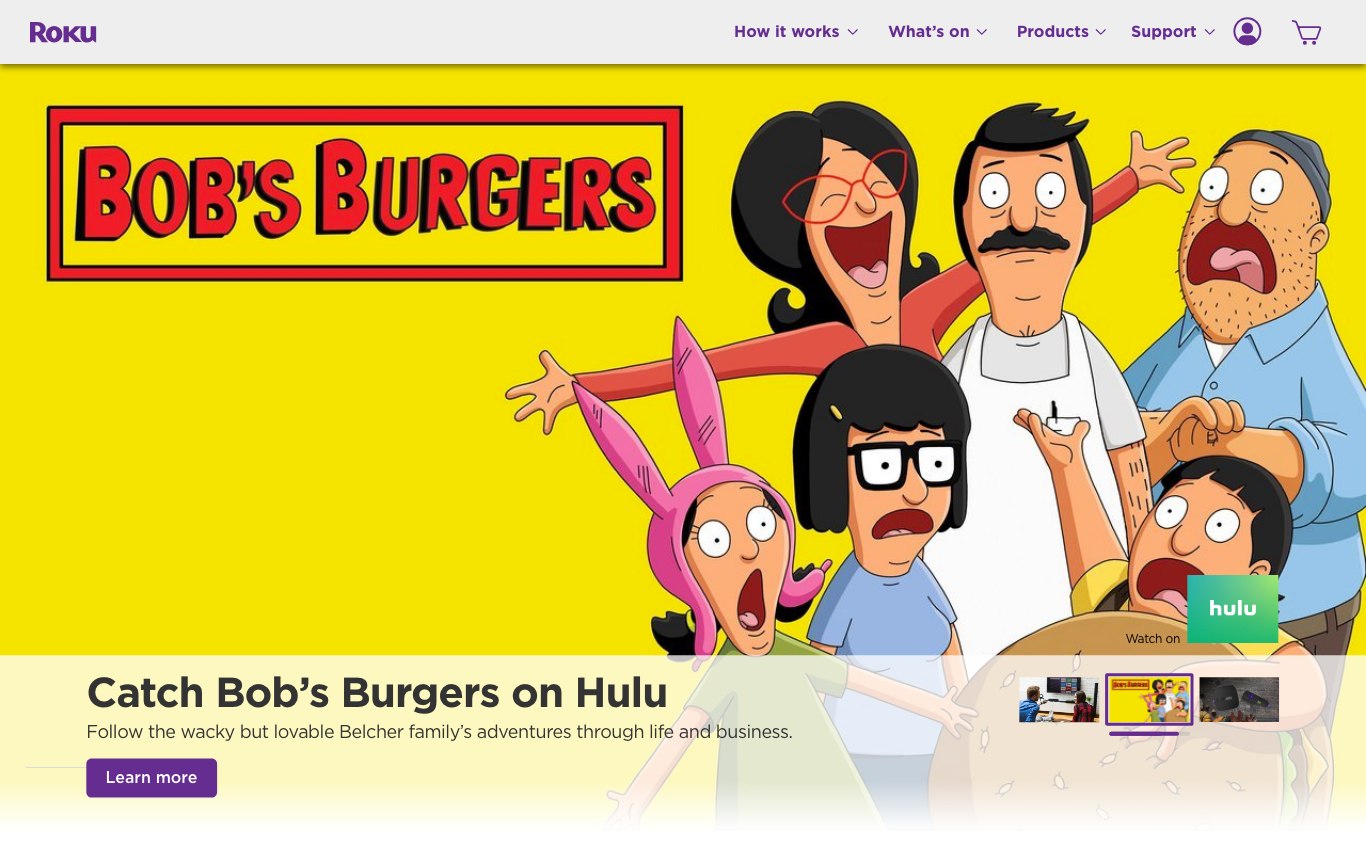
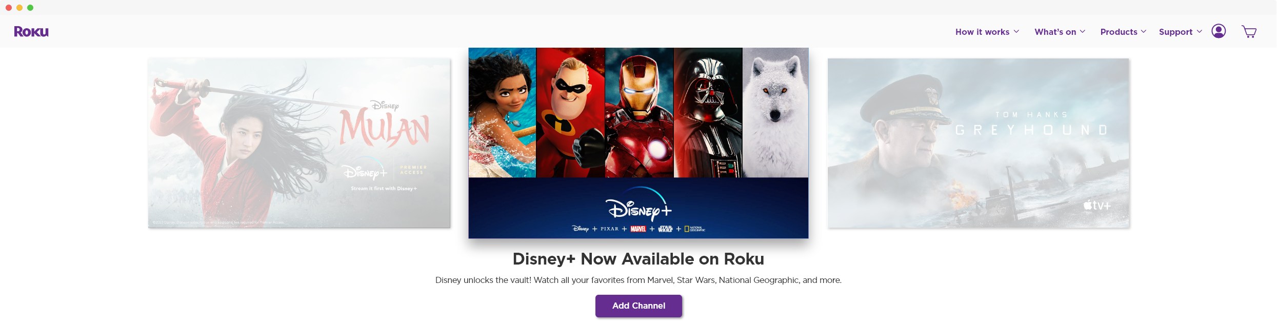
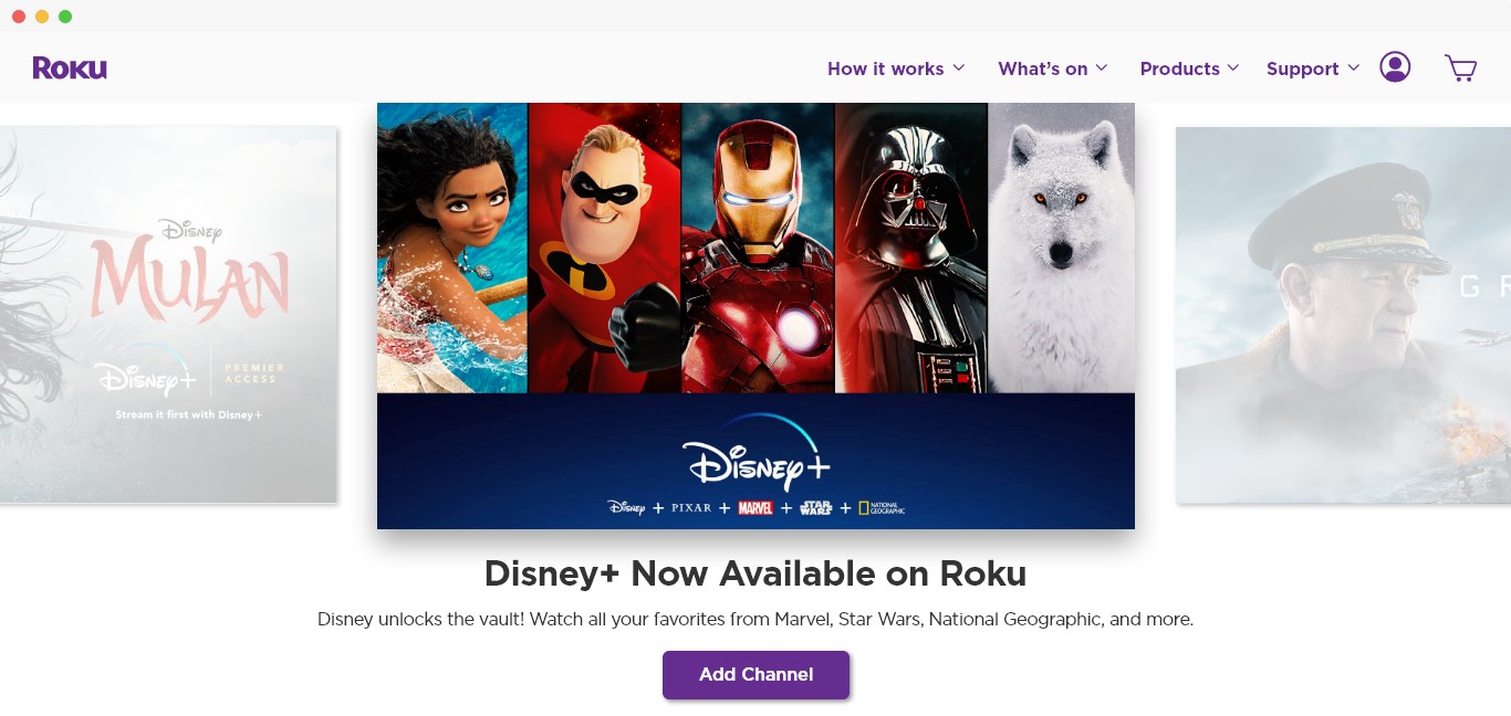
Visit Roku.comThe first video-enabled, mobile-friendly, hero component meant to excite and educate users on Roku content availability. Over two million Roku.com users can now experience high-quality video trailers and content offers from Disney+, Netflix & AppleTV, and much more.
- Design Strategy
- •
- Interaction Design
- •
- Micro-Interactions
- •
- User Interface Design
- •
- Responsive UI
- •
- Prototyping
- •
- Design Specifications
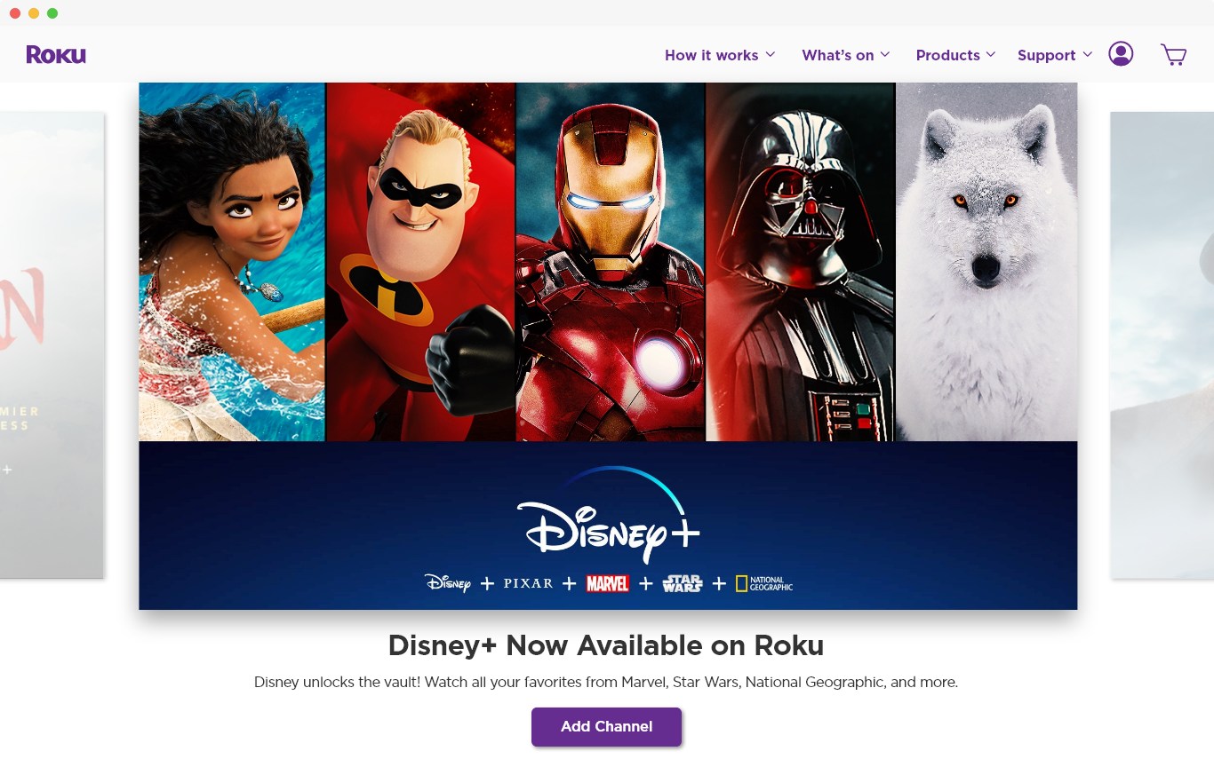
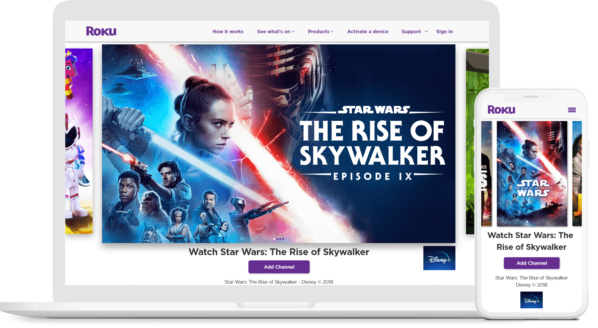 The hero component's desktop variant with Star Wars: Episode IX - The Rise of Skywalker in focus.
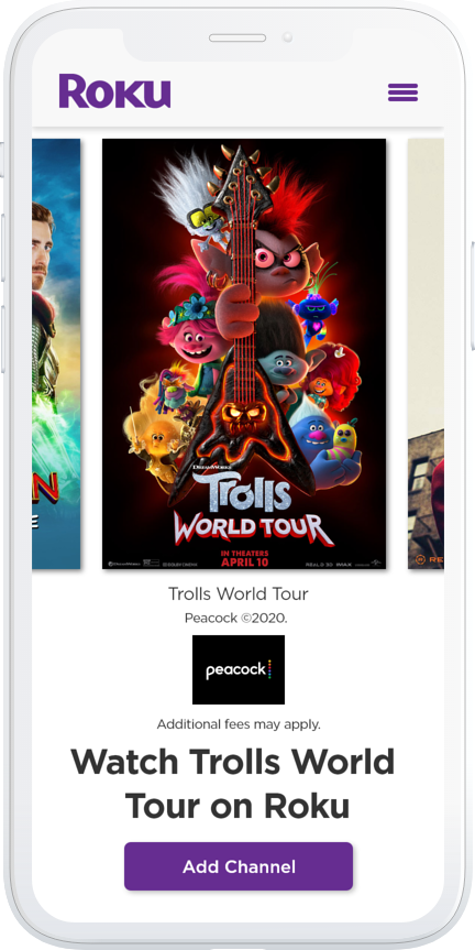
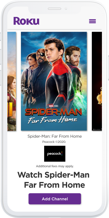
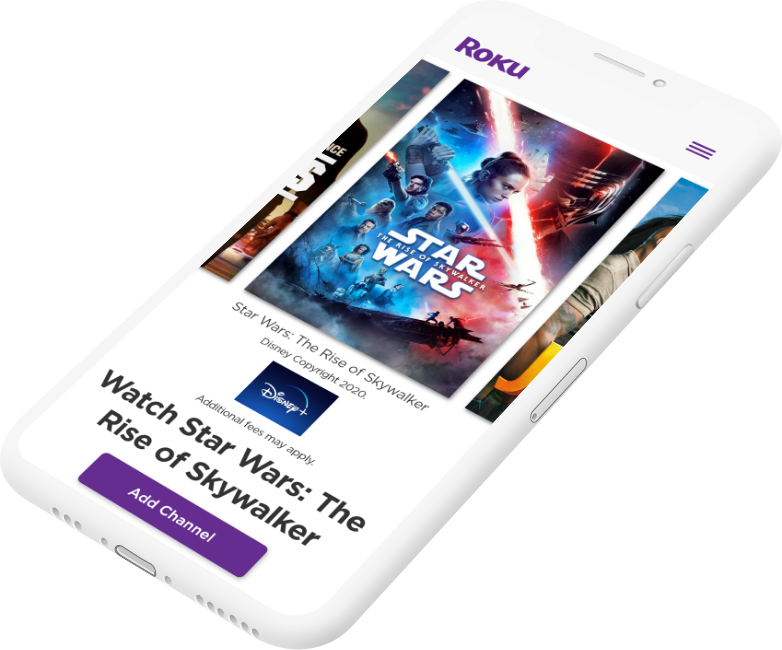 The mobile variant of the hero component with Star Wars: Episode IX - The Rise of Skywalker in focus.
Problem
Early variants of the Roku.com hero used image sizes without regard for standard video dimensions and aspect ratios (e.g., 16x9, 4x3). Coupled with web page layouts that were not exactly designed with specific breakpoints, they caused major headaches depending on the viewport size.
A lot of time was spent reconfiguring the creative layout between the limited visual real-estate and the varying degrees of creative compositions from different partners.
Audience
To a large degree, Roku and its content partners are among the target audience for this project as we all benefit from this product's efficiency.
Potential cord-cutters (e.g., consumers who want to drop cable and try streaming) are the target audience as well. The hero component allows Roku to promote and educate users about what, when, and how to watch.
Goal
The goal of this project was to create a more scalable, responsive, video capable hero component. Ultimately, this would be a much more impactful storytelling mechanism across desktop, tablet, and mobile devices. Meant to delight and drive excitement in prospective and existing users.
Key Objectives:
- Standardize content aspect ratio
- Improve responsive UI behavior
- Reduce creative churn
- Display multiple promotions and offers
- Video enabled
My Role
I was the Lead Interactive Experience Designer working together with a Front-end Developer and a Project Manager. I led the design strategy and all aspects of the experience, including information architecture, micro-transitions, user interface design, and prototyping.
We conducted prototype demonstrations and gathered feedback from cross-functional teams, including Legal, Product & Partner Marketing, and Web Engineering.
Design Process
With business requirements locked in and only a few weeks to deliver, I began layout explorations. I explored variants that used a tabbed approach. Versions that utilized thumbnails and even full-screen variant. These are a few of the earlier explorations:
 An early version of the Roku.com hero component utilizing an extremely slim aspect ratio. The layout for these variants would degrade very quickly outside of a specific pixel dimension.
 An early desktop variant showing a product offer.
 An early exploration of the hero that utilized thumbnail images with a white overlay. The overlay caused problems because it could cover up important information in the lower third of the creative composition.
 An early exploration of the hero that utilized thumbnail images with a white overlay. The overlay, as well as layout cropping, tanked this iteration.
User Interface Design
The Carousel
We ultimately landed on a fully responsive carousel that could handle the most extreme viewports. Below are screenshots from my responsive design artboards to demonstrate how each breakpoint would look.
 An extremely wide browser viewport (2482 x 600px). Even with a smaller browser height, the carousel, it's headline copy, and the button still needed to be visible.
 The hero displayed at a nearly 16:9 viewport ratio. At this ratio, you can see much more of the content on the left and right sides of the hero image in focus.
 The hero displayed at a nearly 1:1 viewport ratio. The left and right slides are designed to peek from the left and right sides of the browser viewport.
 Mobile viewport utilizing 3x4 aspect ratio.
 Mobile viewport utilizing a 3x4 aspect ratio.
Interaction Design
The hero component is designed to hold multiple promotions, ads, or videos (limited only by loading times). Non-active hero images would still need to be visible even when not in the active (e.g., front and center) state. I accomplished this by guaranteeing that the images on either side of the primary hero always "peek" out at least 40px. That's just enough for users to notice and tap them.
 Hero images on both the left and right of the active hero (shown in blue) are always visible on desktop viewports, regardless of width.
Micro-interactions
Micro-interactions play a vital role in this component's behavior as they subtly inform the user of how the component works. It also allows users to see that more content is available to view.
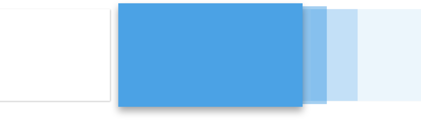 Illustration of the transition that occurs when a user clicks the right hero image. It slides into the "focus" position with slight ease from the direction it was clicked.
 Illustration of the transition that occurs when a user clicks the left hero image.
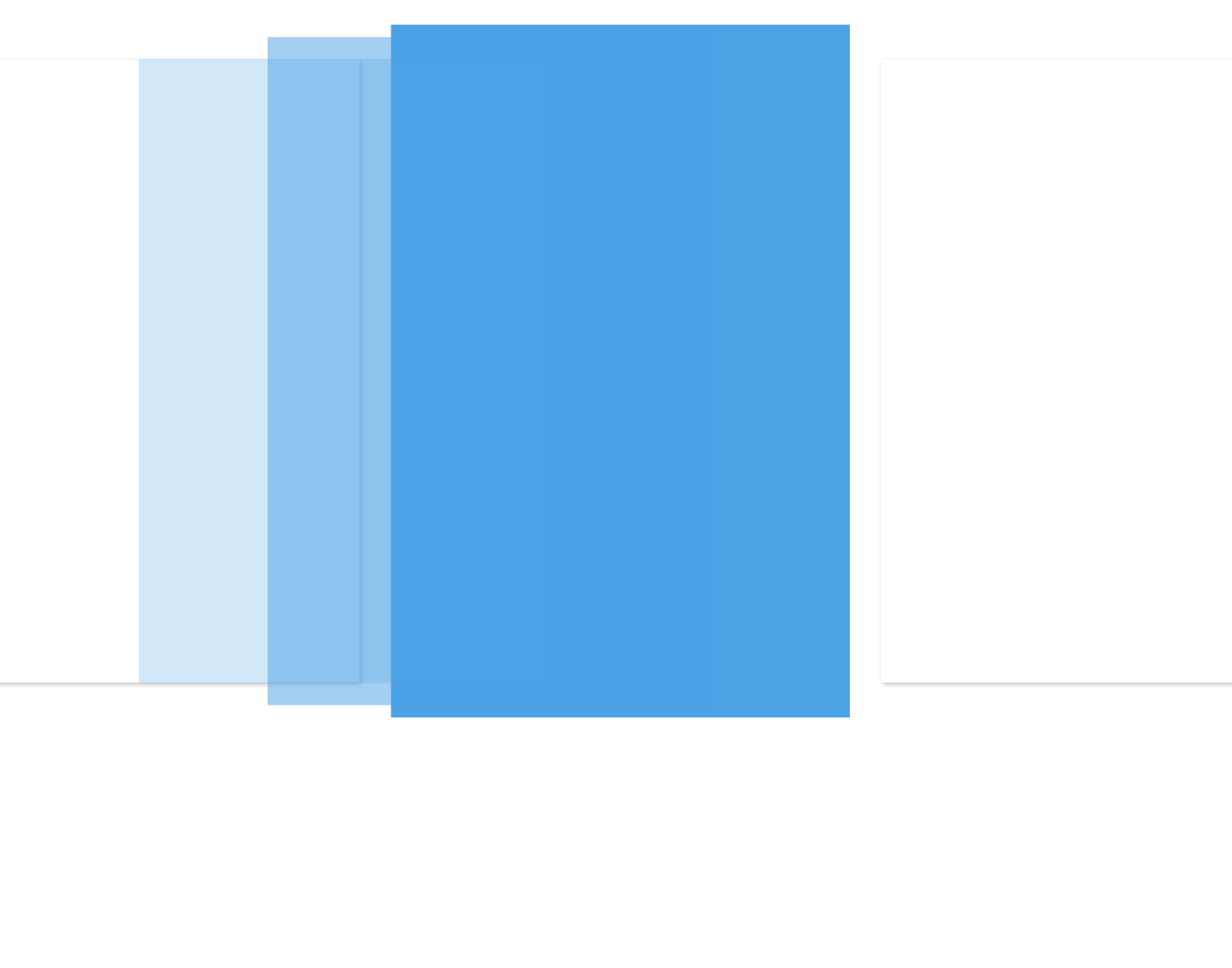 Illustration of the mobile viewport transition.
Video Playback
On load, and by default, all videos are automatically muted not to disturb users who may be in quiet environments. Video hero assets will also automatically restart and play when they become active. Each video is allowed to play in its entirety before automatically switching to the next hero slide. Of course, users always have an option to unmute video with a mute toggle button.
 The entire hero is clickable along with the button underneath it. Clicking any hero asset, regardless of whether it's a video or image, will send users to the appropriate web page.
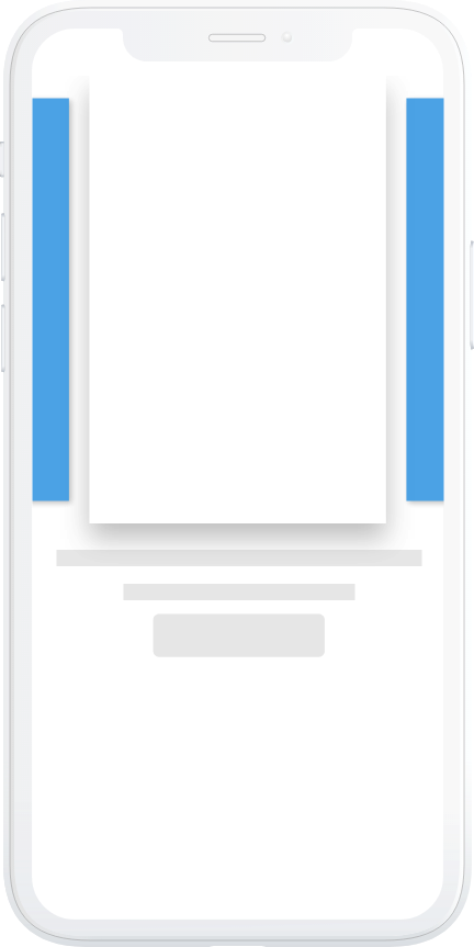 The carousel on mobile allows for horizontal scrolling with your thumb or index finger. Left and right-hand side hero images (highlighted in blue) are also always visible.
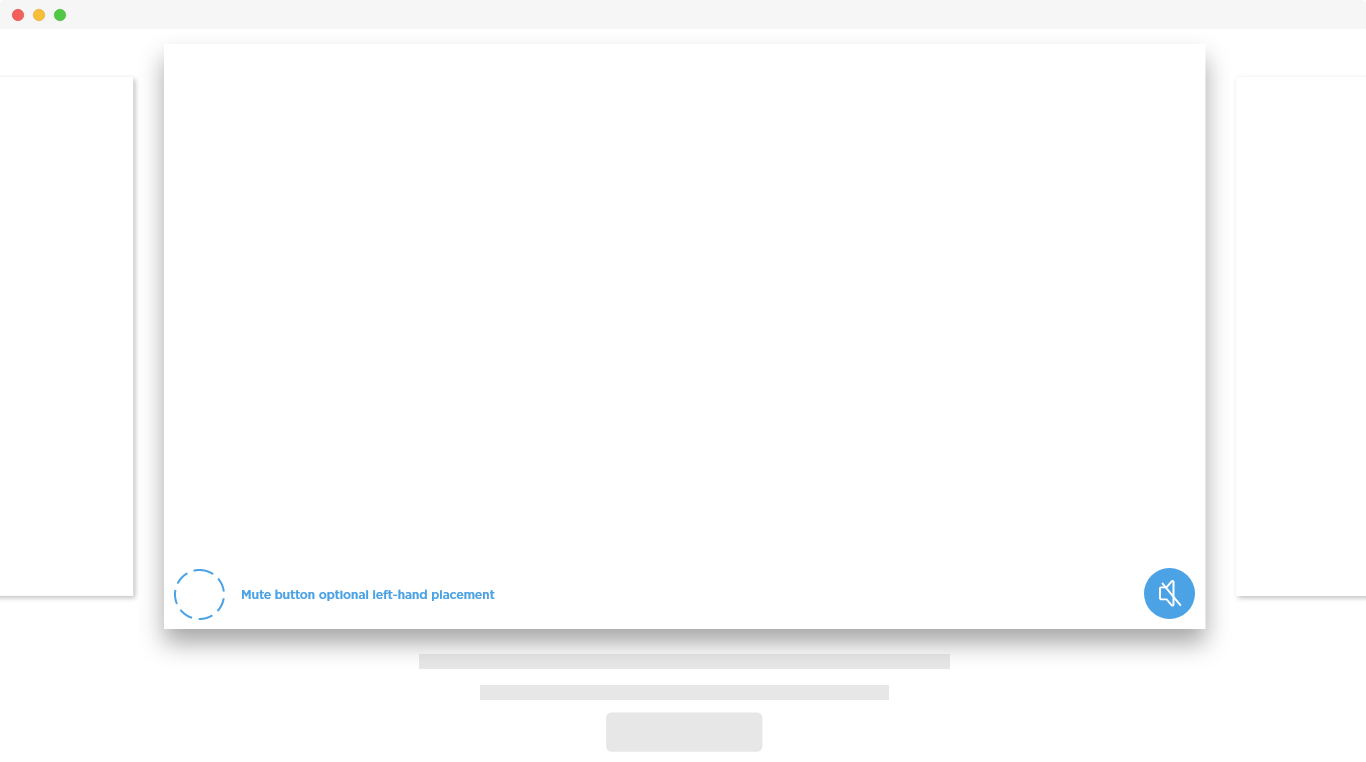
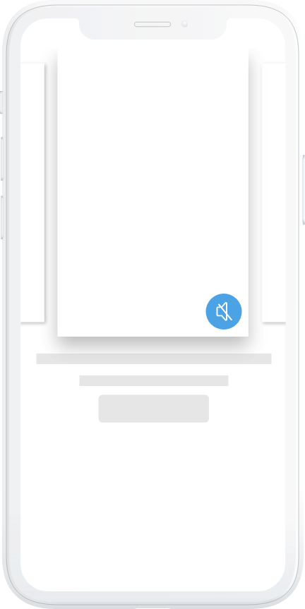 The mute button is also accessible on mobile devices (highlighted in blue).
Prototyping
In the interactive world of products, prototypes are a fantastic way to actually "experience" a new product or concept without spending the time and money it costs to build the real thing. Not everything is best "experienced" by talking about the experience and how it works. This was one of the prototypes that helped stakeholders envision the possibilities.
Design Specification
I typically create design specification documents to describe interactions. Depending on the project schedule, or the Developer that I'm working with, I can produce printable PDFs or all-digital design specifications.
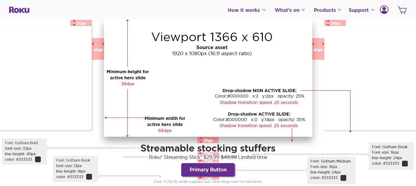 Desktop design specification describing styling for a 1366 x 610-pixel viewport.
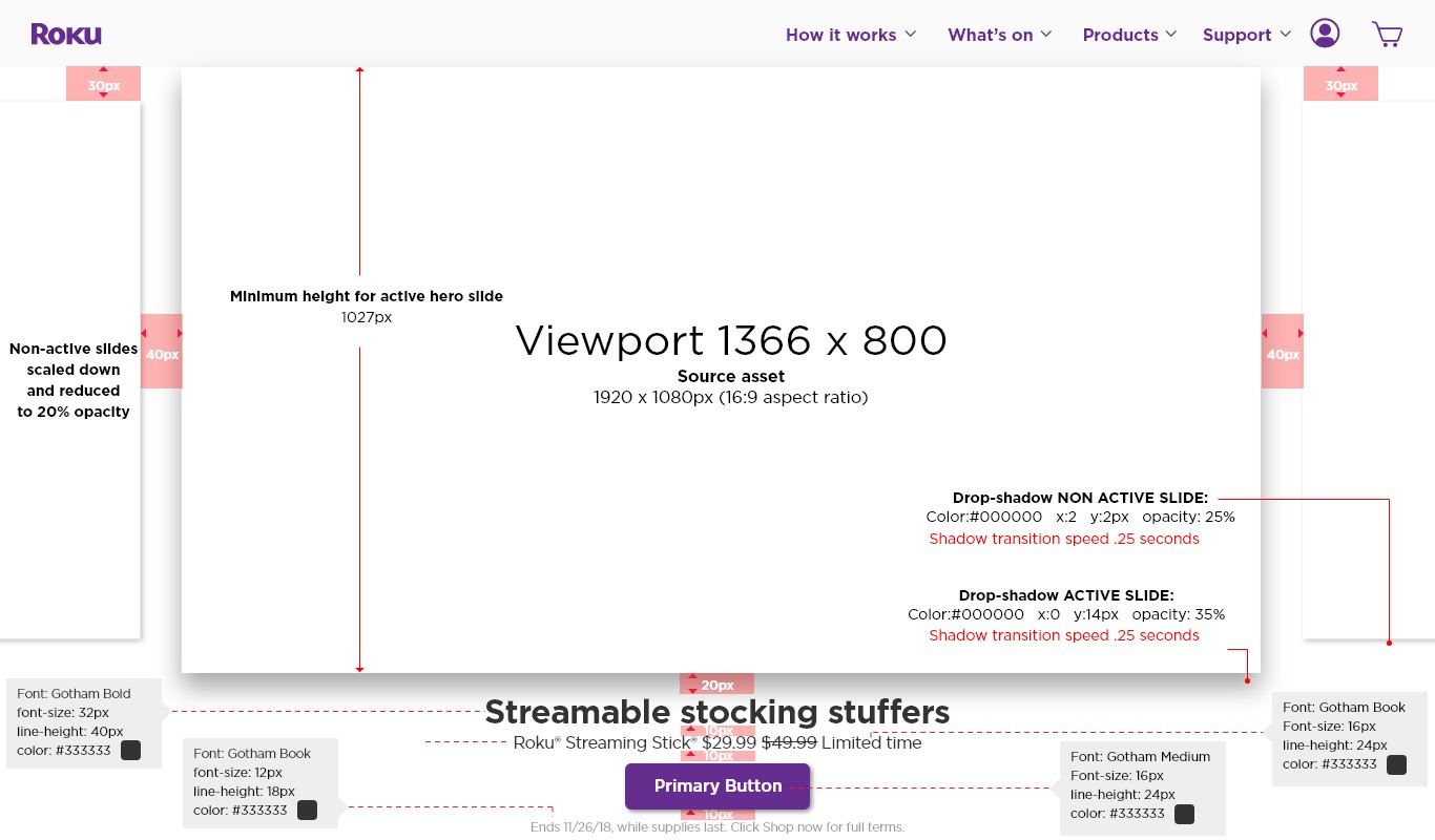 Desktop design specification describing styling for a 1366 x 800-pixel viewport.
Results
The Roku.com hero has contributed to a 44% increase in the number of streaming hours on Roku devices. It has virtually eliminated "extra" or "unnecessary" design and development work in terms of adding, removing or simply updating hero content.
The hero is reusable, meaning it could be placed on another web property, in another context, if necessary. Lastly, it supports video playback, works on mobile, tablet, desktop, and comes with delightful micro-interactions built-in.