Roku Jobs Portal
Visit Roku.com jobs portalThe explosive popularity of the Roku brand and products created an immediate need to improve our recruitment efforts. The first step toward that goal was to redesign the jobs portal from the ground up.
- Design Strategy
- •
- User Interface Design
- •
- Responsive UI
- •
- Prototyping
- •
- Information Architecture
- •
- Interaction Design
- •
- Micro-interactions
- •
- Visual Design
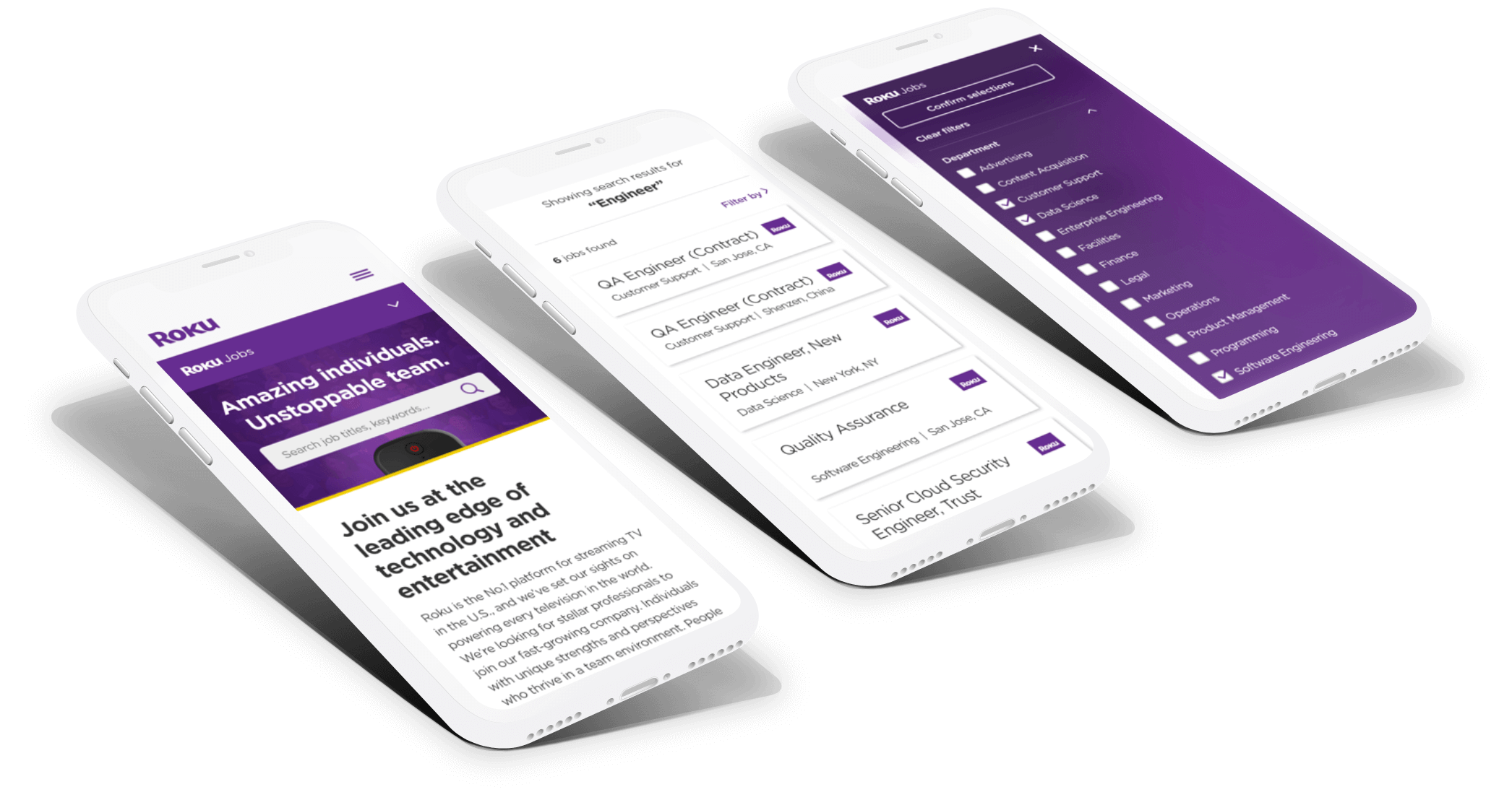 Various screens from the Roku jobs portal, including the homepage, menu, and search results page.
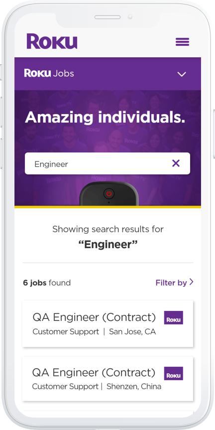 Mobile view of the search results page for the keyword "Engineer."
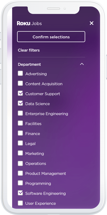 Mobile view of the Roku jobs portal filters menu.
Problem
Mobile Usability
The original Roku Jobs website had a significant set of mobile usability issues, information architecture, and navigation. Prospective candidates had to scroll through a single web page that listed every job at the company visible.
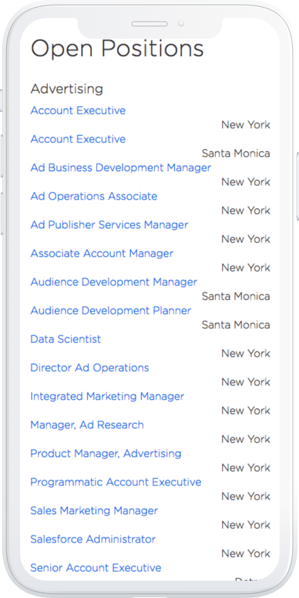 The jobs listing page from the previous design showing misaligned job/city pairings.
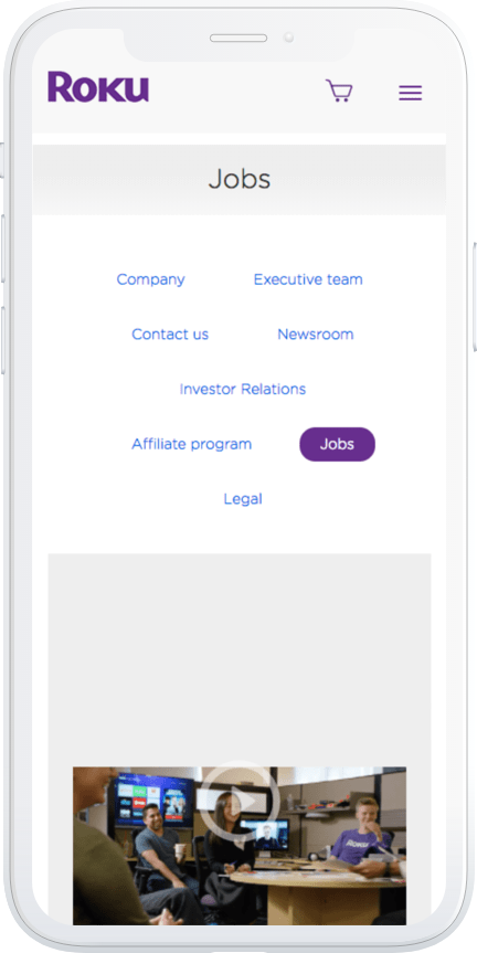 The Information Architecture and misaligned layout make for a confusing navigation experience.
My Role
I was the Lead Experience Designer on a seven-person, cross-departmental team. Members included the Vice President of Recruiting, Director of Communications, a Project Manager, a Front-end Developer, and a professional photographer.
Audience
Prospective applicants and new-grads were the target audience for this project. It was also in our own interests (Roku as a business) to improve our market presence as a great place to work and paint a better picture of what it means to work at Roku.
Goal
This redesign's goal was part of a broad company-wide strategy to attract more top talent and new-grads globally. Another important goal was to tell a better story of work/life balance at Roku and what it means to be a part of the industry's most dominant streaming brand.
Key Objectives
- Improve mobile usability
- Improve page layout
- Improve information architecture
- Enable ability to search jobs
- Display employee testimonials
Design Process
Once our goals and objectives were locked down, I began exploring several new sitemap structures to help the team envision how a new job portal could be organized. The entire project took about 3-4 months to complete (from concept to launch).
Employee Interviews
With the help of our Director of H.R., we reached out to 40 employees to allow them to be promoted on the new website. We interviewed those that were open to it and posted their testimonials on the website as well.
Photo Shoots
We had a lot of fun during the professional photoshoots they were scheduled in the Roku offices. A few of the chosen shots below:
 I designed a random image generator which changes collage images on page reload.
 Collage image variant.
 Collage image variant.
Wireframes
I began exploring new layouts that would be much more responsive and easy to navigate regardless of viewport size (e.g., desktop, tablet, or mobile devices). I utilized components from our web-based design system, including fonts, colors, and cards.
 The new search results layout on a mobile device.
 The search bar remains sticky (e.g., always visible) at the top of the mobile viewport when users scroll through search results.
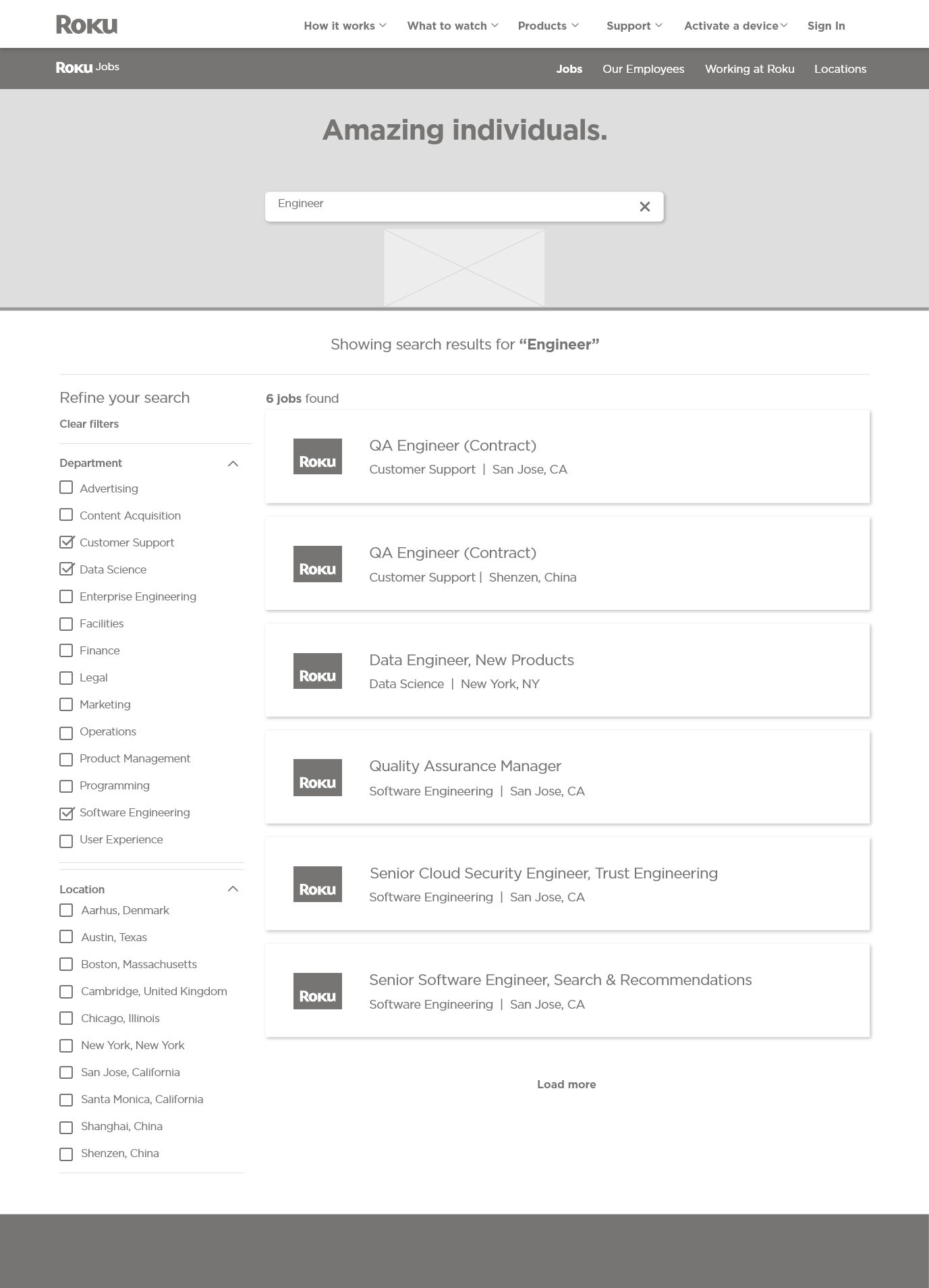 The desktop view of the user's search results page for the keyword "Engineer."
User Interface Design
I had a rare opportunity to refresh the branding of the previous jobs website. This version embraces much more Roku purple and a yellow accent line borrowed from the product packaging. I introduced the Roku remote as it is the most recognized element by millions of users globally.
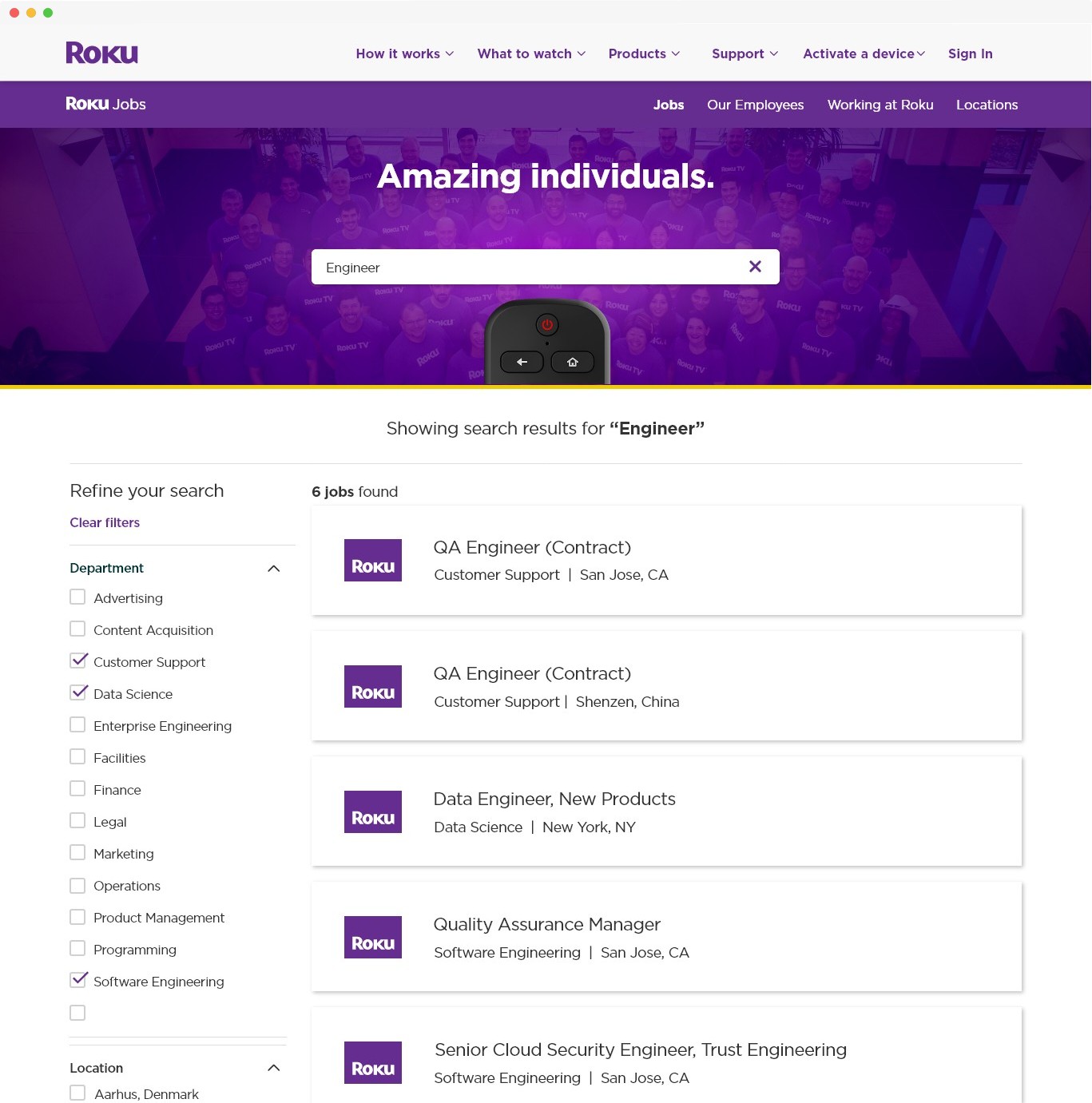 The final design for the Roku Jobs search displaying results for the keyword "Engineer."
 Minimized view of the sticky search component allows users to change keyword search anytime during the scrolling experience.
Prototyping
Micro-interactions
This project allowed me to introduce more micro-interactions, which give a delightful, but non-distracting touch to the entire experiences as users navigate the portal. The purpose of this particular micro-interaction allows the user always to search, even when scrolling the page.
Design Specifications
I also created a detailed interaction design and behavior specification for our Front-end Development team to follow in addition to the prototype.
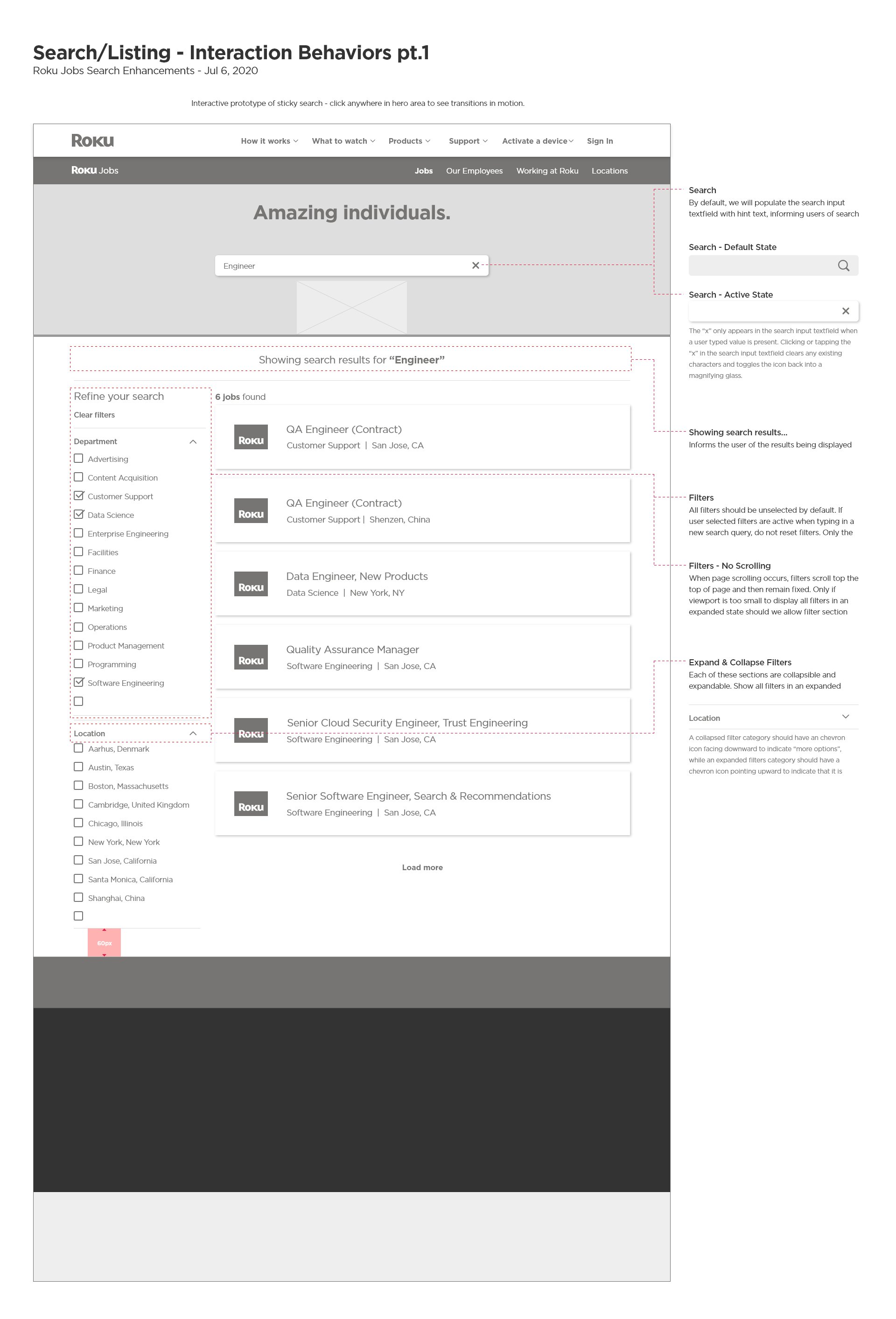 A desktop design specification describing product functions and behaviors.
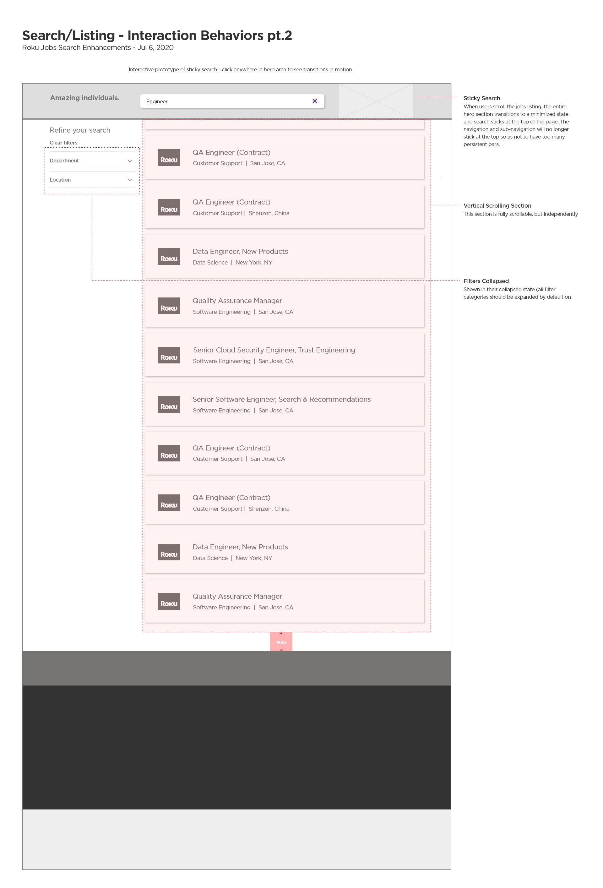 A desktop design specification describing collapsable filters.
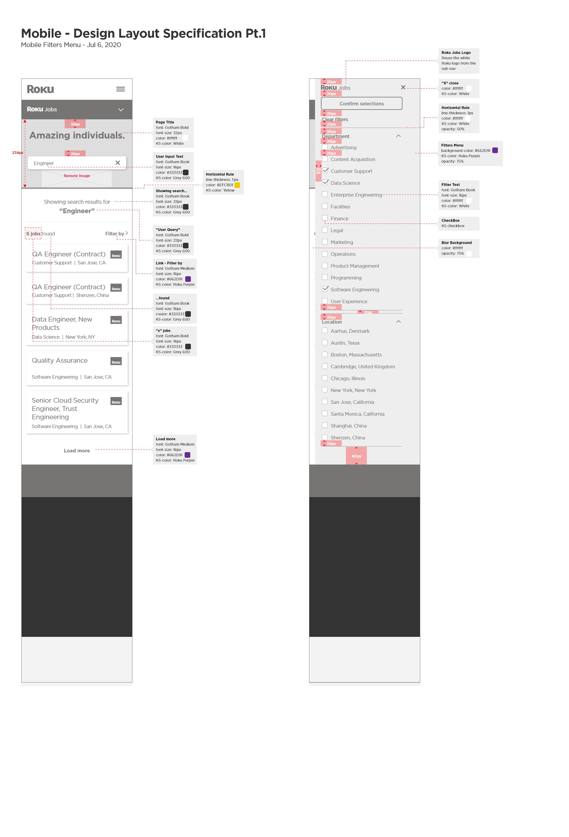 A mobile design specification describing user interface styles and layout.
Results
The newly branded Roku Jobs portal is now shared daily across LinkedIn by the entire Roku management and H.R. team. It serves as the primary destination for experienced professionals and new grads who want to learn more about the company, the culture, and the people that drive it forward.
Mobile Friendly
The new Roku Jobs experience works on all mobile devices now, making it much easier for prospective applicants to learn, search, browse, and apply for jobs at home or on the go.